Filed under: serif
Return to the workbench←

Exploring something new—drawing and process wise. Attempting to finally track my time when working on some fonts. I roughed through 23 characters in 2.5 hours.


Preview of Gait featuring an alternate “R” and possibly one of the first looks at the ampersand.


How to draw a saber-toothed “3”:
- Rotate the “2” and cut it half
- Paste in the bottom half of the “S”
- Combine them


Working with Sean O’Connor on font production/character set expansion of a custom font.
I promise I didn’t leave the ampersand like this.
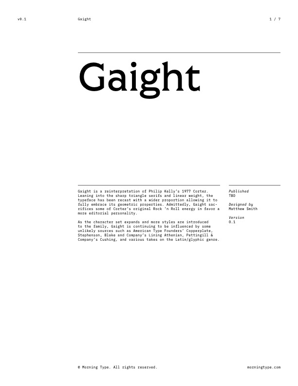
Gaight • Future Fonts Application
/assets/files/future-fonts/gaight/Morning-Type_Future-Fonts_Gaight_Application_2021-02-28_01.pdf
For posterity, here is the rejected application submitted to Future Fonts for Gaight—later renamed Gait. For a little more information, view this Twitter thread which was shared later in August.

Very much an accident, but there is something really interesting happening here just waiting to be uncovered.
