This is Morning Type’s workbench: a place to document in progress fonts, scrapped ideas, research, helpful links, and more.

While Morning Type will continue to use social media, the workbench will be the most up to date and tend to feature exclusive content. This is a small way of encouraging you to reclaim your feeds, and prioritizing your independence over the ads and algorthims of conventional social platforms. You can “follow” the feed via RSS.

I would also like to note that the name for the workbench comes from The Pyte Foundry, the inspiring design practice of Ellmer Stefan.

Exploring something new—drawing and process wise. Attempting to finally track my time when working on some fonts. I roughed through 23 characters in 2.5 hours.

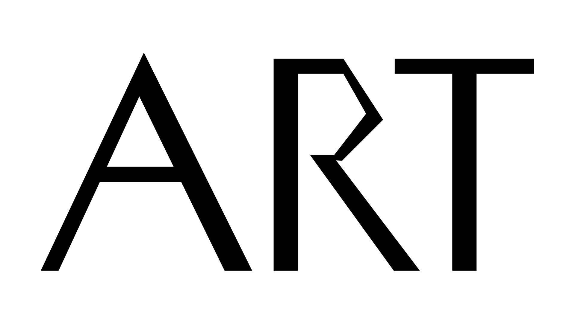
Preview of Gait featuring an alternate “R” and possibly one of the first looks at the ampersand.

If you’re going to draw a “grotesque” make it ugly, you cowards

✅ Bad letters
✅ Bad spacing
✅ Bad grotesque

Experiments with the “f” and “t”

Yesterday @shiva_n_ shared a really nice gothic he is working on which has a notched 1. I’ve had a sketch for a notched 4 sitting on my desk for years, and so now I try pitching the idea to everyone. I even tried convincing Mass Driver to add it to MD Primer. I only ever talk about it, so I figured I should share one of my own! This is Duck and it’s notched 1 and 4. The name will probably change, but for now it is 🦆

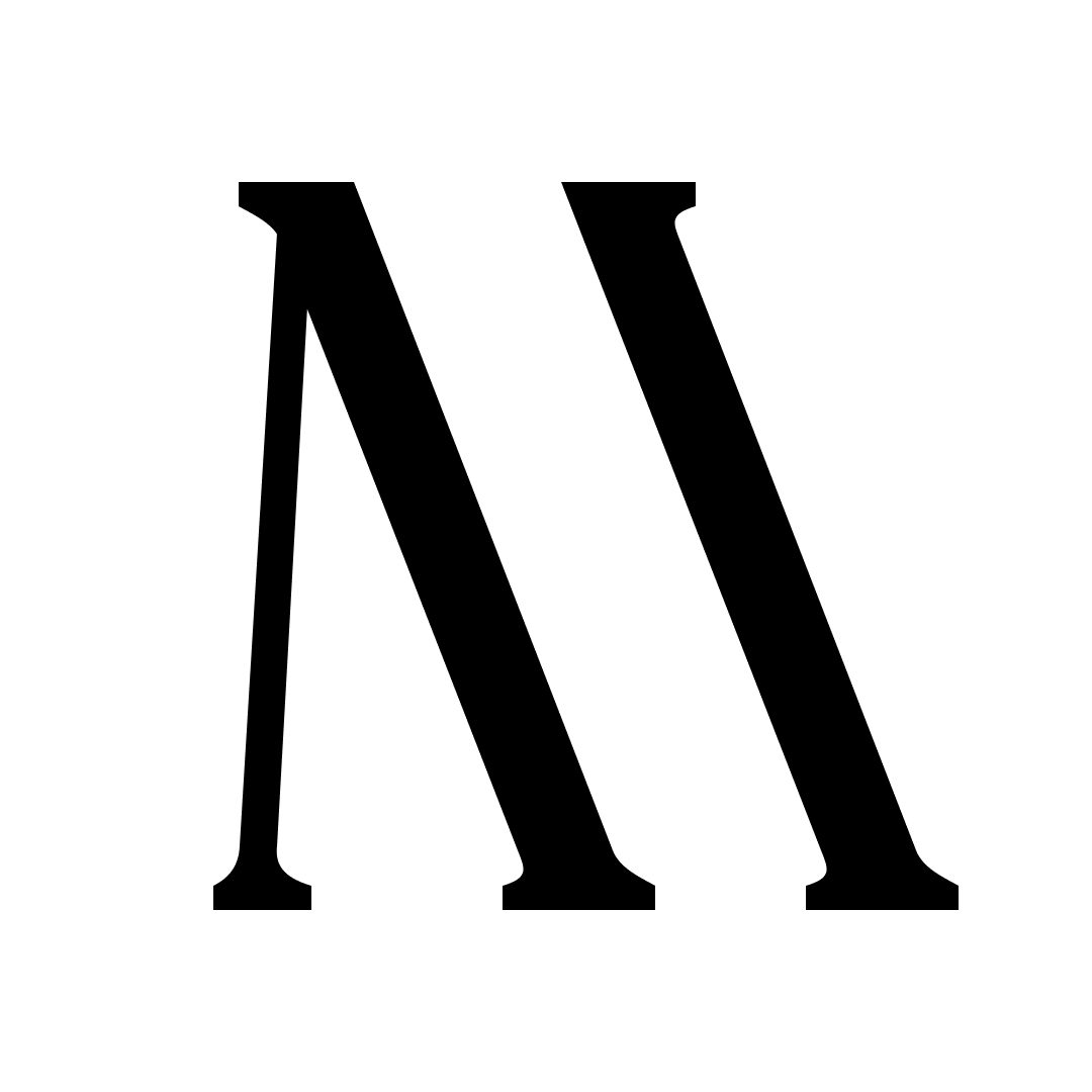
One of my favorite typefaces is Caslon Rounded, and for the longest time I’ve always dreamt up a fictional slab counterpart. It’s difficult enough to keep things narrow when you add serifs, but it’s a whole different ball game when you then round those serifs. While it may not fit seamlessly with Caslon Rounded, I think this still has a similar energy.

You can license a digitization of Caslon Rounded from Commercial Classics.

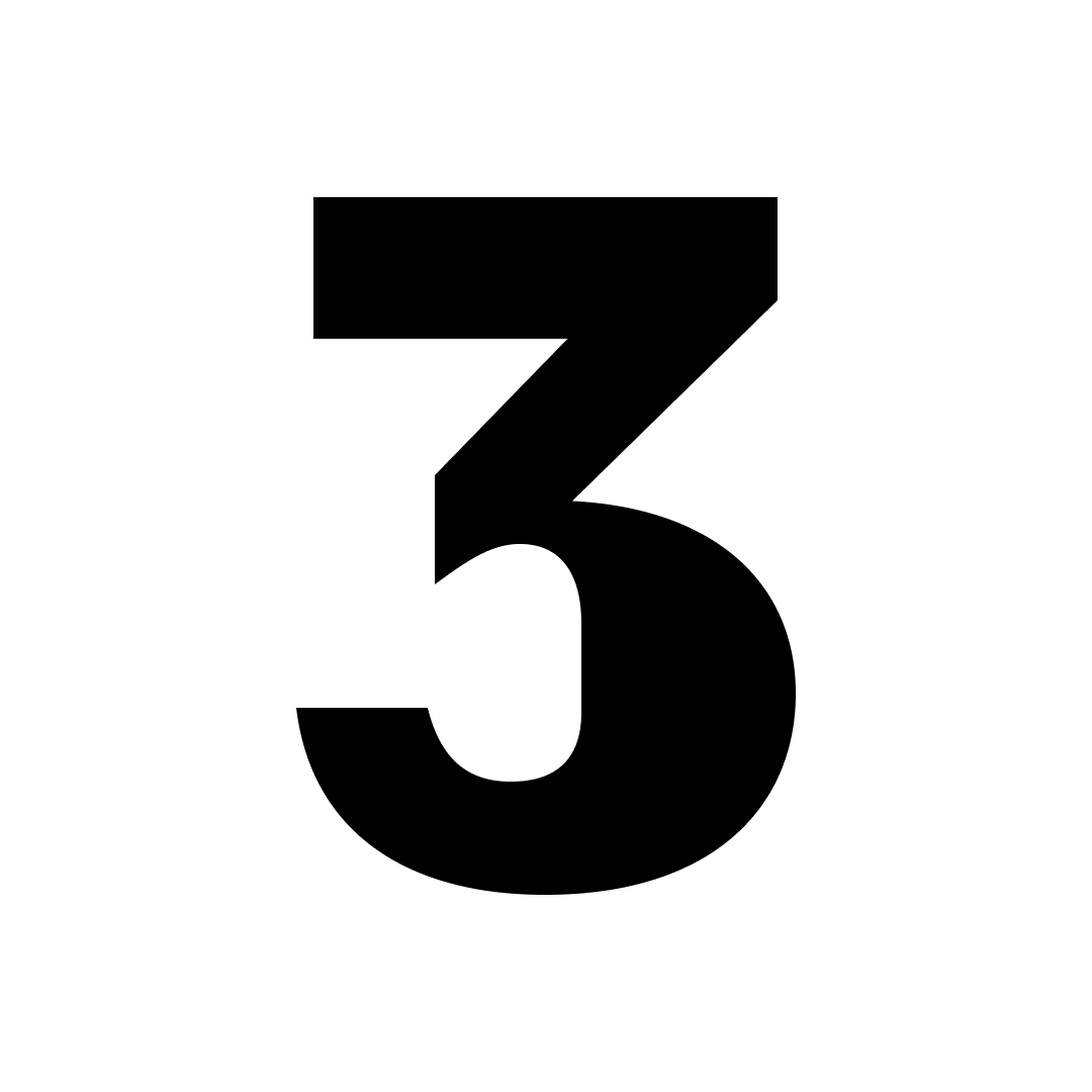
How to draw a saber-toothed “3”:

  • Rotate the “2” and cut it half
  • Paste in the bottom half of the “S”
  • Combine them

Realizing that I never posted this dented “n”

Working with Sean O’Connor on font production/character set expansion of a custom font.

I promise I didn’t leave the ampersand like this.

Why does this remind me of the scream mask?

Those outer curves actually looks quite nice.

The beginnings of a “B?”

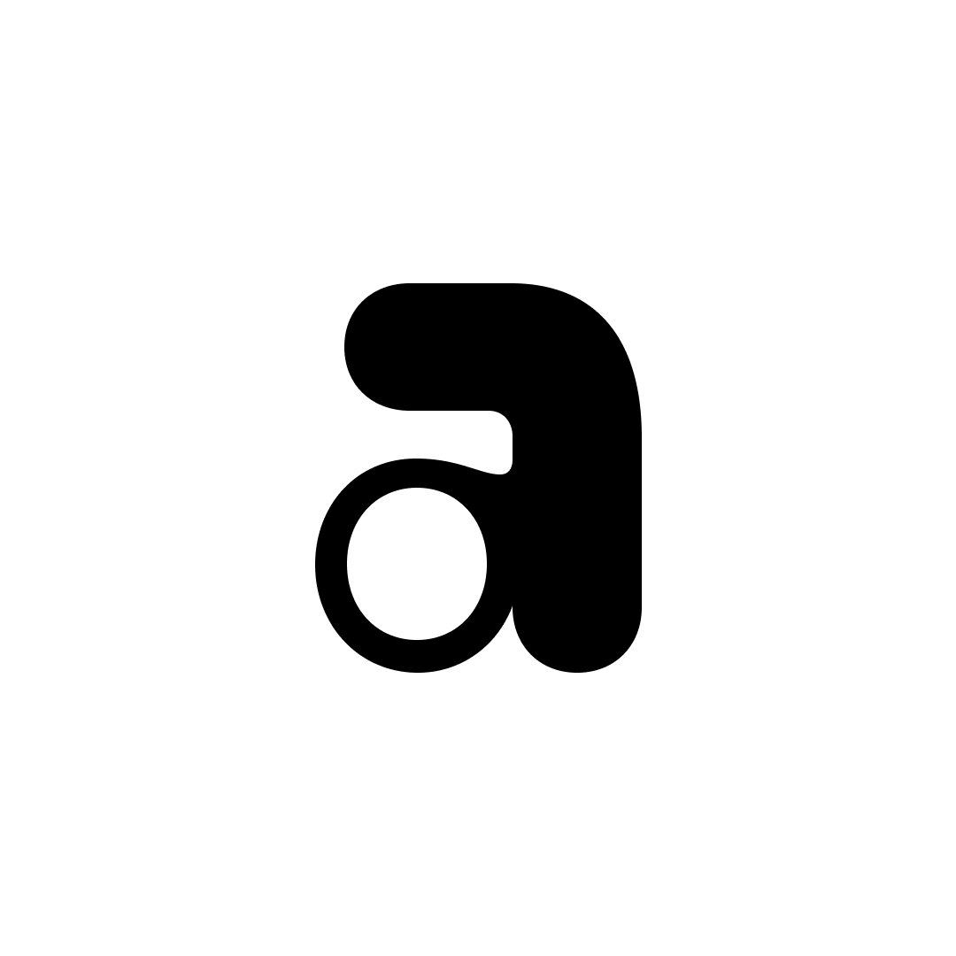
Extrapolated “a” goes hard

me: ✍
s: 🥴

⚠️ Not intended to look good ⚠️

Here’s an actual look at my process.

I gave myself to 30 minutes to rough through these numerals so I can better consider them as a whole.

With a basic idea down, it will be easier to refine relationships, widths, spacing, etc.

Haven’t shared one of these in a while.

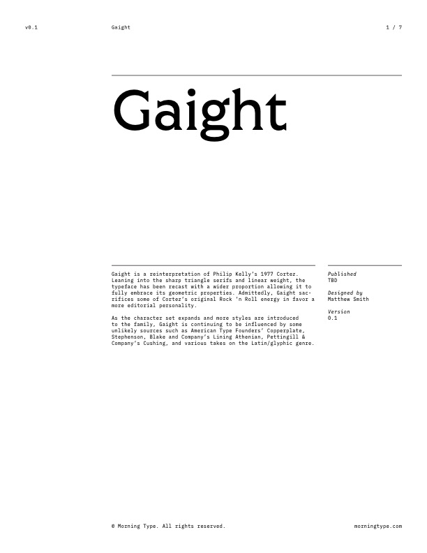
Gaight • Future Fonts Application

/assets/files/future-fonts/gaight/Morning-Type_Future-Fonts_Gaight_Application_2021-02-28_01.pdf

For posterity, here is the rejected application submitted to Future Fonts for Gaight—later renamed Gait. For a little more information, view this Twitter thread which was shared later in August.

*saves for later*

Not as promising.

There might be something here.

“Micro”

Sincerely an accident.

Very much an accident, but there is something really interesting happening here just waiting to be uncovered.

Ah yes, the graceful beginnings of drawing an S.