Filed under: process
Return to the workbench←Exploring something new—drawing and process wise. Attempting to finally track my time when working on some fonts. I roughed through 23 characters in 2.5 hours.
Preview of Gait featuring an alternate “R” and possibly one of the first looks at the ampersand.
If you’re going to draw a “grotesque” make it ugly, you cowards
✅ Bad letters
✅ Bad spacing
✅ Bad grotesque

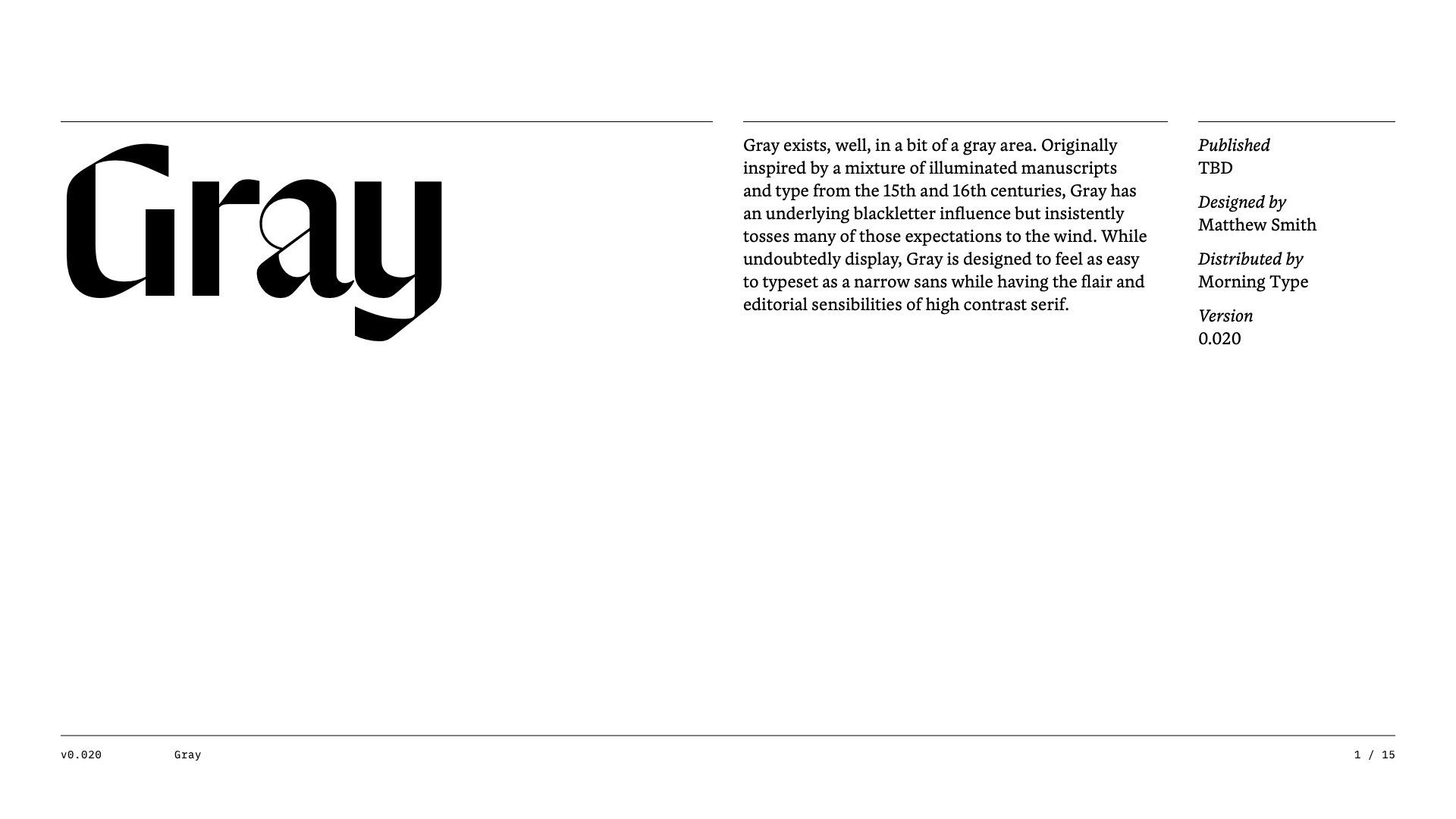
Gray • Future Fonts Application
For posterity, here is the rejected application submitted to Future Fonts for Gray.
Yesterday @shiva_n_ shared a really nice gothic he is working on which has a notched 1. I’ve had a sketch for a notched 4 sitting on my desk for years, and so now I try pitching the idea to everyone. I even tried convincing Mass Driver to add it to MD Primer. I only ever talk about it, so I figured I should share one of my own! This is Duck and it’s notched 1 and 4. The name will probably change, but for now it is 🦆
One of my favorite typefaces is Caslon Rounded, and for the longest time I’ve always dreamt up a fictional slab counterpart. It’s difficult enough to keep things narrow when you add serifs, but it’s a whole different ball game when you then round those serifs. While it may not fit seamlessly with Caslon Rounded, I think this still has a similar energy.
You can license a digitization of Caslon Rounded from Commercial Classics.
How to draw a saber-toothed “3”:
- Rotate the “2” and cut it half
- Paste in the bottom half of the “S”
- Combine them
Working with Sean O’Connor on font production/character set expansion of a custom font.
I promise I didn’t leave the ampersand like this.
⚠️ Not intended to look good ⚠️
Here’s an actual look at my process.
I gave myself to 30 minutes to rough through these numerals so I can better consider them as a whole.
With a basic idea down, it will be easier to refine relationships, widths, spacing, etc.

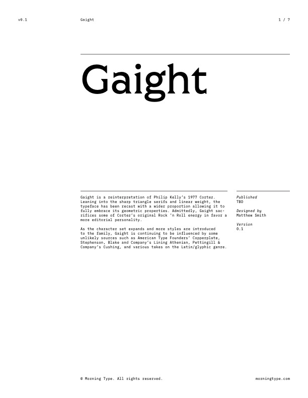
Gaight • Future Fonts Application
For posterity, here is the rejected application submitted to Future Fonts for Gaight—later renamed Gait. For a little more information, view this Twitter thread which was shared later in August.
Very much an accident, but there is something really interesting happening here just waiting to be uncovered.


