Filed under: gray
Return to the workbench←
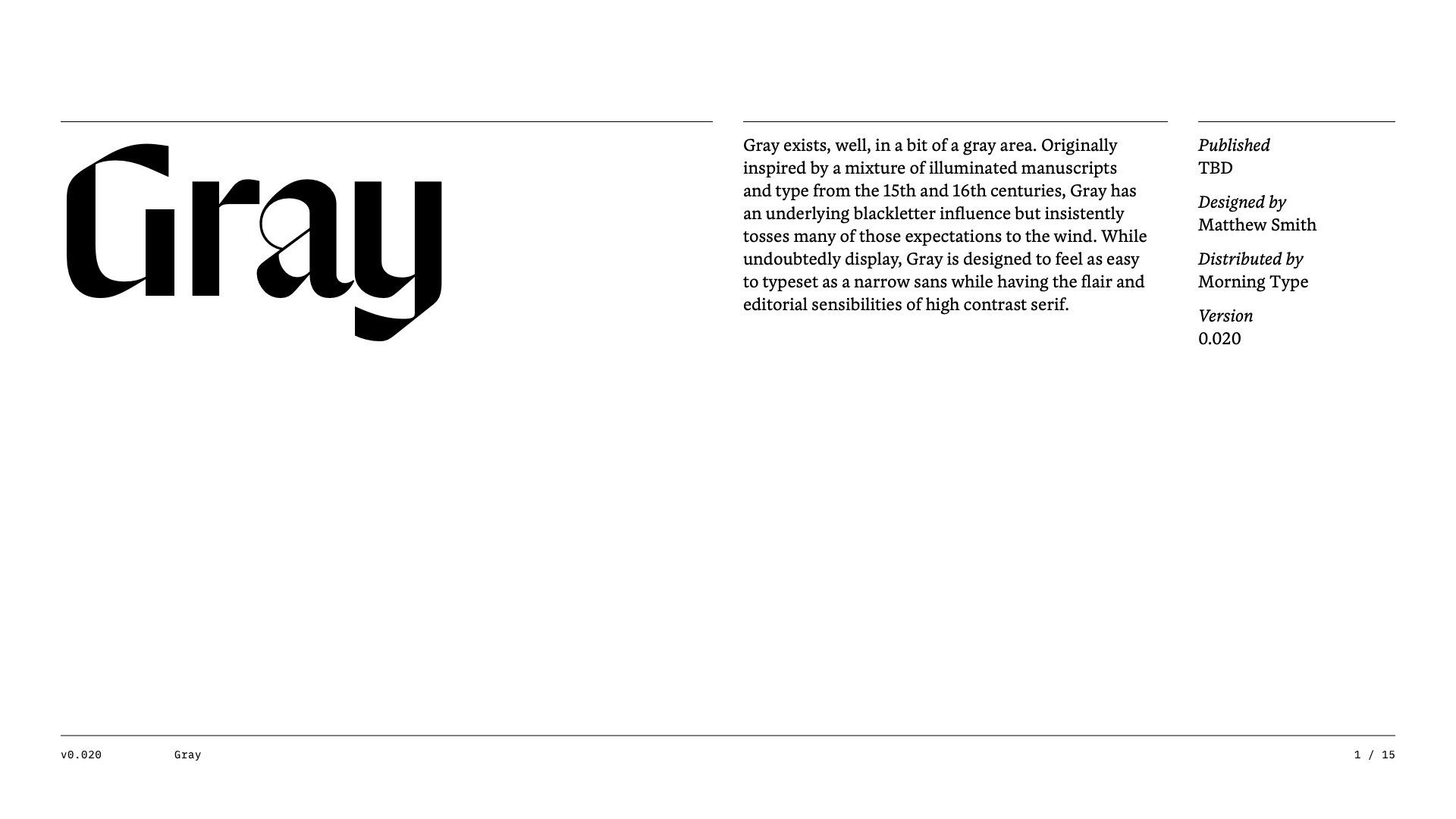
Gray • Future Fonts Application
/assets/files/future-fonts/gray/Morning-Type_Future-Fonts_Gray_Application_2022-09-12_01.pdf
For posterity, here is the rejected application submitted to Future Fonts for Gray.
⚠️ Not intended to look good ⚠️
Here’s an actual look at my process.
I gave myself to 30 minutes to rough through these numerals so I can better consider them as a whole.
With a basic idea down, it will be easier to refine relationships, widths, spacing, etc.
